Jina Seong
Build a banner system for efficiency
UX Case Study 2019
Overview
I created the new banner system of Grab app for better performance. I identified the fundamental problem of the banner creation process and challenged traditional banner experience.
My role
I managed multiple stakeholders by sharing existing banner problem,  proposing the hypothesis, prototyping, validation through research and a/b test.
Business opportunity
Why banner?

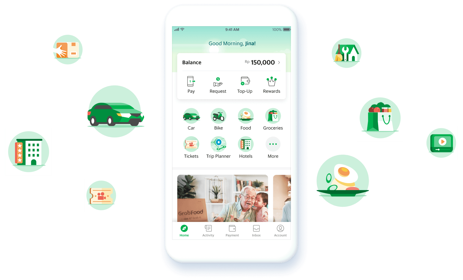
As Grab app is growing, vertical services wanted to promote campaigns, and service announcements on the home screen to acquire new customers. Thus, we need a component ensuring the visibility of the  information for potential business opportunity.

User Segment
Who’s It For
Grab App Customer
'Explorer' user group enters Grab app to look for information for making a decision. For example, Grabfood users look for promo to get a discount on their order.
Banner Content Creator
Internal partners want to acquire new and retention users by providing promotions and announcement on the home screen.
Customer Problem
How's The Current Banner Experience?

01

Banner Blindness

In other e-commerce apps in South East Asia, they commonly use banners with an image with flashy colours, illegible graphic fonts with too much information. These types of visual make it difficult for users to find relevant information from a banner. If users recognise the banner as an ad, they tend to ignore it.

02
Inconsistent Content Assets

It is difficult to provide consistent banner, feed content and visuals in the current company organization. Grab has plenty of local marketing teams and creative agencies for 8 different countries. From the existing Feed and banner content, my team learned that there is a lack of resources to educate, communicate the guideline, and audit the outcome. As a result, it caused critical problems of user experience.

03
Ineffective Communication
We want to provide multiple messages, such as promotion, service announcements, on-boardings, systematic messages, and anniversary greetings. However, based on the cognitive limitation theory, it is difficult for users to digest multiple messages at the same time. It is not an effective way to deliver what we want to tell users. Also, there is not enough space to add another component above the fold.
Content Creator Problem
How To Create a Banner Content?
At least 11 tasks, 6 different stakeholders
The existing skin banner and feed content creation process have had problems that it needed too much effort but it still didn't align with product strategy as there were too many different marketing creative teams and it was difficult to audit all outcomes.
Also, it needed to be implemented by engineers. It was not scalable and needed lots of design and engineering efforts. It had a dependency with app release, it needed to plan early, so the projects had been always rush.
How might we create
an efficient and consistent
banner for our users?
Key Insights
01
It would cause banner blindness by the flashy color and image, illegible graphic font, too much information on the banner
02
It would be better to improve the banner creation process by having a new system to produce the consistent banner, rather relying solely on guideline document
03
It should be reusable for varied use cases for ads, promotions, product announcement and system messages
Hypothesis
01

If users are able to quickly catch the benefit that they interested in by the banner that is simple and easy to understand, then it will lead the new service usage and transaction.

02

If banner content creator easily upload only the content and its key visual in a limited size by using a content management system with a consistent layout, then we will be able to provide a consistent banner experience.

Key Metrics

Since most users decide which service to use before opening Grab app, they directly navigate to the service entry point. Thus, the main goal of the banner is to increase awareness and consideration of service or campaign that the banner promotes, rather than increasing click through rate. We measured the success of banner as how many users try the service or promotion, how much the revenue to be driven. The banner CTR was a supportive metric.

Usability Test
Testing The Idea
We conducted usability testing with our Indonesian users. We had a question to find the banner content for participants with above prototypes.
01
“I thought it is just ads”
Most users couldn’t notice the banners with fancy hotel pictures and illustrations. We found the one of assumption that the banners with an appealing image could attract more user attention is incorrect.
02
“I remember only the movie ticket promo”
We want to provide multiple messages, such as promotion, service announcements, onboarding, systematic message, and anniversary skins. However, based on the cognitive limitation theory, it is difficult for users to digest multiple messages at the same time. It is not an effective way to deliver what we want to tell users. Also, there is not enough space to add another component above the fold.
03
“It is now slow connection, it is better than just stopping without explanation"
All participants understood the system message with the connection messages, and they took an action for refresh immediately.
We got positive feedback and results from the banner that shows clear message by the literal value in the header and a simple illustration.
The MVP
Based on the research result, I created the banner MVP UI spec for A/B testing. The other designer on my team worked on the banner creation management tool. I shared what will be in the necessary schema for the banner.
Also, I focused on creating the clear and detailed guideline for internal stakeholders with content strategy. Previously, different content creators interpreted the guideline in multiple ways for feed content, I added many examples that were straightforward and easy to understand.
Our team built the banner component on the mobile application and a banner management tool as a web application, then we collected banner requests from other marketing and product teams for conducting A/B tests.
From October 7th to January 3th, we tested one banner per week and 8 different banners per platform (iOS and Android).
A/B test Result
How's The Impact?
40%↑
The first time
user
36%↑
Challenge
engagement rate
6.2%↑
Pay to merchant
revenue
4.6%↑
Banner CTR

For confidentiality reasons, I have omitted the actual values for these metrics
The most successful banner was introducing the Grab Challenge service by using Disney’s Frozen movie tickets as incentive.
A negative outcome was that as the new service revenue increased, the existing services’ revenue decreased. When there was a banner promoting Food delivery service, the transport revenue was dropped. This is because the users who were going to use transport went to the banner then exited the app.
11 tasks -> 5 tasks
6 stakeholders -> 3 stakeholders
The most happiest part for me was to reduce the painful creation process. There were lots of back and forth from sharing the feedback and iterating the assets by marketing and creative agency. Now, with the clear guideline and CMS tool, product designer and engineer doesn't need to involve the process. The assets quality was so much increased and the process became efficient.
Further Iteration
What's Next?
Upgrade universal banner for more cases
Since the other Grab verticals needed the banner on their screens, I revamped the  banner UI for different use cases and created a new component guideline for company designers. Also, it significantly increased using the banner as an advertising platform, I needed to provide more schema and color options.  I published the banner component to Grab design system.
Design System Across Grab
How It Worked
As internal partners learned about the banner on the home screen, they started to use it to promote their new feature. Also, ads team started to sell the banner as ads inventory.  Many new services adopted the banner system on their service home screen.
As the banner monetised as new ads inventory, the banner got the positive feedback from internal colleagues. Many fellow designers contacted to get the strategy and adivces for adopting it on their screens.
Retrospective
Concluding Thoughts
The simple banners are common in some markets in the world. However, in the quickly growing market, there was less opportunity to optimize the traditional editorial ad for the mobile user experience.
However, by aligning the new system with a clear problem statement, data, research insight, and proposing a new banner management system, I could introduce new banner experiences for users and stakeholders. It was a great opportunity for me to take the initiative on the whole project and got a successful result.
Thanks for watching!
Create a trustworthy dating app
Redesign
Grab Home Screen
©2020, Jina Seong